
Following is a Looker Studio dashboard build for a Tech B2B lead generation paid media program. The data is retrieved via API connections and automatically normalized for consistency from several media sources (Google, Meta, LinkedIn, and Bing), web analytics (Google Analytics), and CRM (Saleforce), then consolidated into a unified data warehouse (Big Query). This dashboard enables detailed spend to sale KPI visualization from media all the way through downstream sales and revenue, with the ability to slice and compare campaign categories, countries and more. Marketers and media team members can see where their budgets are being spent across regions and product lines, quickly identify their best and worst performing media channels, placements and ads, compare year of year performance for designated periods, and much more.
Displayed metrics that cascade through the various tabs, charts and tables include full spend to sale KPIs itemized by media channel, regions and product category including cost, impressions, clicks, click rates (CTR), cost per click (CPC), lead form conversions, form conversion rates (CVR), cost per conversion (CPA), other high value site interactions, sales qualified leads (SQLs), cost per SQL, sales, cost per sale (CPS), revenue, return on ad spend (ROAS), and ROI with customer lifetime value (CLV ROI).
Global Tech Demand Gen Dashboard
Data Sources
Just a few examples

Meta Ads

GA4
Google Ads
Salesforce
Bing
Data Warehouses
Single Source of Truth

BigQuery
Dashboards
Owned by you. Built to scale. Easy to extend.

Looker Studio
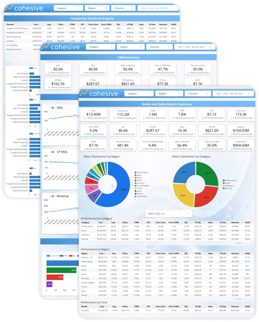
Executive Summary Tab
Overview:
This dashboard provides a complete, end-to-end view of global B2B demand generation performance, connecting paid media activity directly to downstream pipeline, sales, and revenue outcomes. It is designed to move seamlessly from high-level executive summaries into detailed performance analysis across channels, regions, and funnel stages.
The layout highlights how media investments flow through impressions, clicks, leads, SQLs, and closed revenue, while supporting flexible slicing by category, geography, and channel to answer both strategic and tactical questions.
Insights:
By unifying media, funnel, and revenue metrics in a single experience, the dashboard enables teams to quickly identify what is driving scalable growth versus what is generating activity without meaningful business impact. Trends, comparisons, and breakdowns make it easy to diagnose efficiency changes, pinpoint performance gaps by region or channel, and validate whether increases in spend are translating into stronger pipeline and return.
This structure supports faster decision-making, clearer performance accountability, and more confident optimization of global demand generation programs—without relying on disconnected reports or manual analysis.
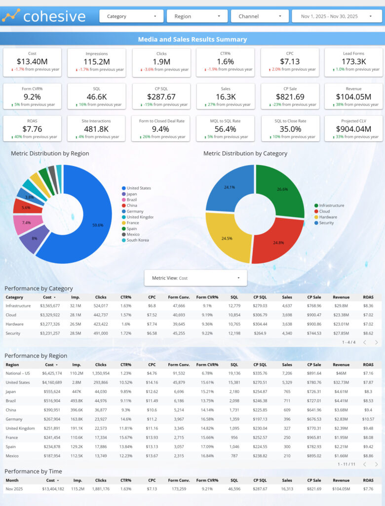
Media & Sales Summary
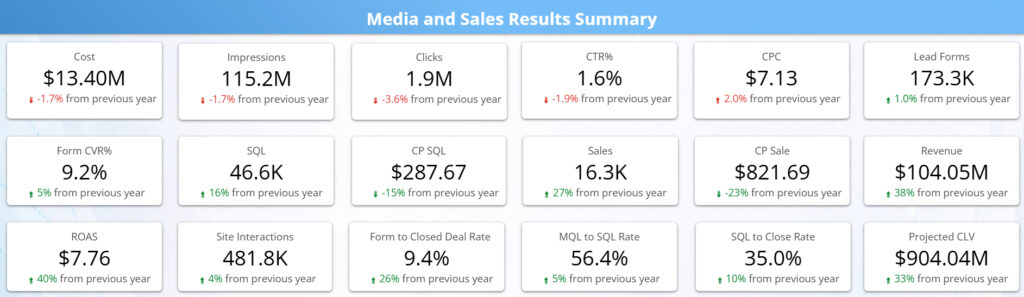
Overview:
The Performance Snapshot component allows executives to get an accurate snapshot of their media performance for the full spend to sale waterfall from cost, though sale, to ROAS and customer lifetime value. It also lets the viewer see instant year of year comparisons for each metric.
Insights:
Viewers of this data will be able to quickly see if their programs are performing, whether the leads they are generating are high quality and converting into actual sales opportunities at a sufficient rate, whether they are paying a viable cost per sale, how they are performing compared to the previous year, and if changes made since are generating better results, and how much long term revenue is being added to the sales funnel from a customer lifetime standpoint. This data can also help to justify more investments in media based on down funnel revenue, sales and customer lifetime value.
Metric Distribution
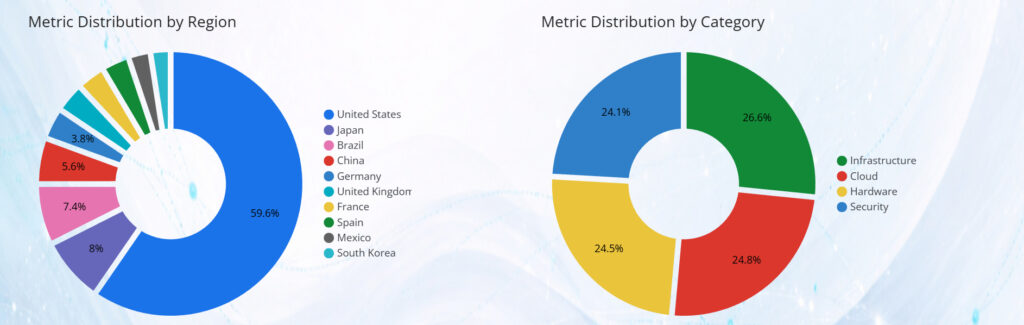
Overview:
This view provides a clear breakdown of how key metrics are distributed across regions and categories, allowing executives to quickly understand where spend, volume, or outcomes are concentrated. The metric selector enables instant switching between cost, volume, and efficiency measures, updating all visuals in sync. This makes it easy to explore distribution patterns without changing pages or rebuilding the analysis.
Insights:
This view helps identify whether investment and results are concentrated in a small number of regions or evenly distributed across the footprint. It reveals which categories or regions are driving the majority of spend versus outcomes, and where imbalances may exist between investment and performance. Executives can quickly
spot over weighted areas, under leveraged segments, and opportunities to rebalance budgets toward regions or categories that deliver stronger efficiency or downstream impact.
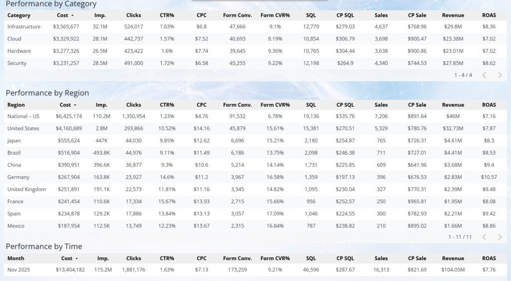
Performance Tables
Overview:
NEEDS COPY
Insights:
NEEDS COPY
KPI Trends
Overview:
This tab provides a longitudinal view of performance across the full demand funnel, showing how key media, conversion, and revenue KPIs evolve over time in a single, consistent framework. Rather than focusing on point-in-time results, it emphasizes directionality, stability, and relationship between metrics as investment scales or shifts.
By presenting spend, reach, engagement, conversion, and downstream outcomes together, the tab allows users to understand how changes in one part of the system influence the rest—without rebuilding analysis for each KPI.
Insights:
Viewing KPIs as coordinated time series helps distinguish normal volatility from meaningful performance change. Teams can quickly assess whether growth is being driven by improved efficiency, increased volume, or rising costs—and whether gains upstream are sustained through later funnel stages.
This tab is especially valuable for identifying early warning signals (e.g., rising costs, softening conversion rates) as well as confirming when optimizations are producing durable improvements. It supports smarter pacing, optimization timing, and expectation-setting by grounding decisions in trend behavior rather than isolated snapshots.

KPI Trends Media
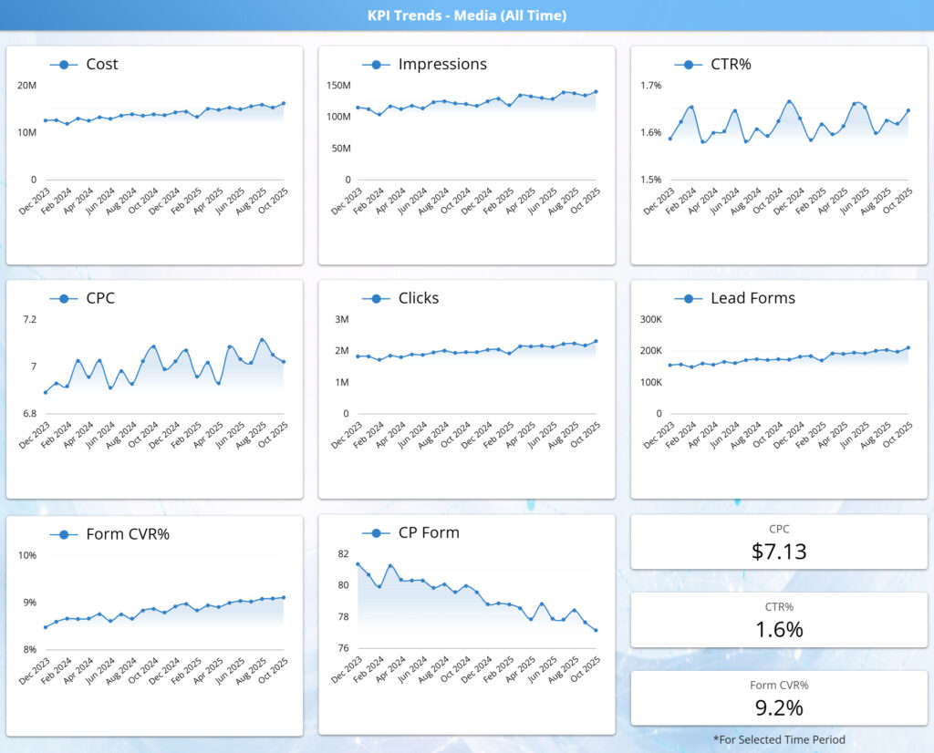
Overview:
This section shows how paid media performance evolves over time across core volume and efficiency metrics. The trend cards track spend, reach, engagement, and conversion behavior together, providing a continuous view of how investment scales and how performance responds. Rather than isolating individual KPIs, this view emphasizes movement and direction, making it easy to understand overall performance dynamics at a glance.
Insights:
By viewing trends side by side, this component reveals whether growth is being driven by improved efficiency or increased cost. It highlights patterns such as rising spend with stable or improving conversion rates, early signs of efficiency erosion, or periods where volume grows without corresponding gains in outcomes. This helps stakeholders assess whether performance improvements are sustainable, identify inflection points that warrant deeper investigation, and distinguish normal volatility from meaningful shifts in media effectiveness over time.
KPI Trends CRM

Overview:
This section shows how marketing output translates into real business results over time. CRM trends track qualified leads through the funnel to closed deals and revenue, alongside key efficiency metrics such as cost per MQL, cost per SQL, and cost per deal closed. Together, these trends provide a clear view of downstream performance beyond media activity.
Insights:
By pairing volume growth with declining unit costs, this view highlights whether pipeline quality is improving, not just expanding. It reveals whether increases in leads are converting into sales efficiently, how revenue and ROAS are trending, and whether gains are driven by better conversion, stronger deal values, or improved sales effectiveness over time.
KPI Drill Down
Overview:
This tab enables deeper investigation into KPI performance over time, combining flexible time-based drill controls with year-over-year comparison to move beyond surface-level trends. Users can pivot from high-level trajectories into specific periods, segments, or inflection points, while maintaining consistent metric definitions across views.
By layering YoY context on top of granular time selection, the tab supports precise analysis of how performance is evolving relative to prior periods—not just whether metrics are rising or falling in isolation.
Insights:
The combination of time drills and YoY deltas makes it easier to separate seasonal patterns from true performance change. Teams can identify whether improvements reflect structural gains, timing shifts, or temporary fluctuations—and whether declines represent normal cyclic behavior or emerging efficiency issues.
This view is especially effective for validating optimization impact, diagnosing period-specific anomalies, and aligning stakeholders on whether changes are meaningful versus expected. It provides the analytical bridge between trend monitoring and action, grounding decisions in both historical context and precise time-based evidence.
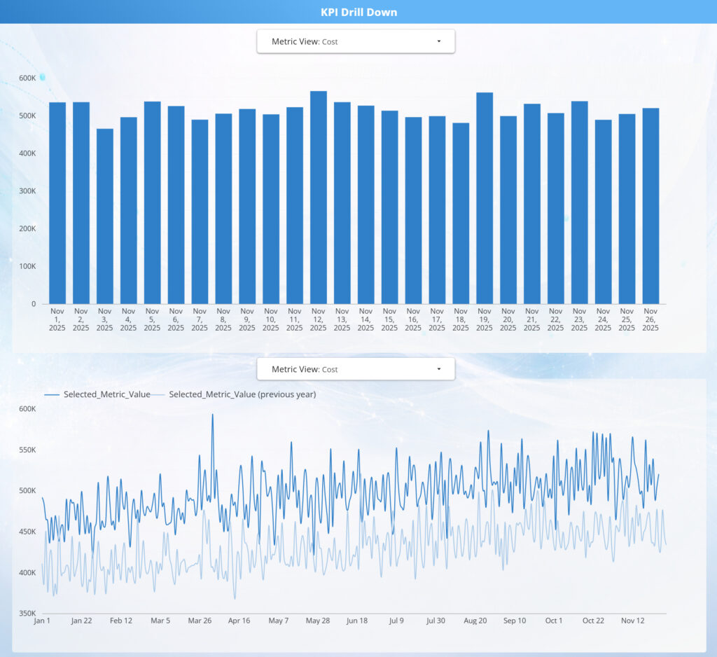
KPI Drill Down Chart
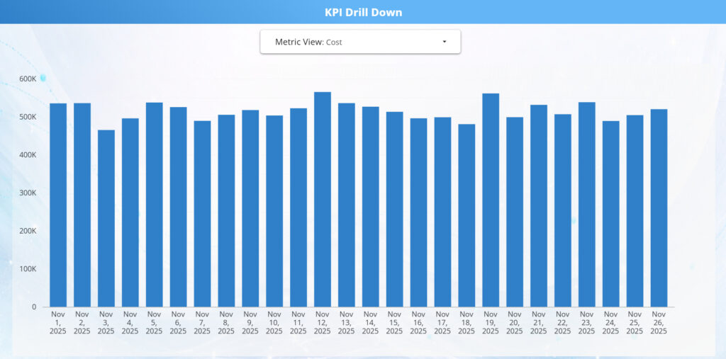
Overview:
This KPI Drill Down chart provides a day-level view of performance for a selected metric, allowing users to move from aggregate trends into granular daily behavior. The metric selector enables quick switching across spend, volume, efficiency, and outcome KPIs, with the chart updating dynamically to reflect the chosen lens.
Insights:
Daily visibility helps distinguish normal intra-period variability from meaningful performance shifts, such as pacing issues, short-term volatility, or emerging inefficiencies. By drilling into specific dates, teams can more easily correlate changes to campaign actions, budget adjustments, or external factors—supporting faster diagnosis and more confident optimization decisions.
KPI Drill Down Year over Year

Overview:
This Year-over-Year KPI Drill Down compares daily performance for a selected metric against the same period in the prior year. By overlaying current and previous-year values on a shared timeline, the view provides clear context for evaluating growth, efficiency, and seasonality beyond short-term fluctuations.
Insights:
The YoY comparison makes it easy to separate structural improvement from normal volatility, revealing whether performance gains are driven by true efficiency, scale, or shifting demand patterns. Divergences between the current year and prior year highlight where optimization efforts, budget changes, or operational improvements are producing measurable impact—or where performance is lagging despite increased investment.
Overview:
This tab connects marketing output to downstream CRM outcomes, providing a consolidated view of how leads progress through qualification, sales activity, and closed revenue. It brings together volume, efficiency, and conversion metrics across the full funnel so teams can evaluate not just demand generation, but pipeline quality and monetization.
By aligning CRM performance with the same filters and time context used across the dashboard, this tab ensures consistent analysis from first touch through closed deal—without switching tools or perspectives.
Insights:
This view reveals whether growth in leads is translating into meaningful pipeline and revenue impact, or if value is being lost at specific handoff points such as MQL qualification, SQL conversion, or deal close. Trends across stages make it easier to diagnose whether issues are driven by lead quality, sales readiness, or downstream execution.
The tab supports more informed optimization and alignment decisions by highlighting where improvements in targeting, qualification criteria, or sales follow-up will produce the greatest return—shifting focus from top-of-funnel volume to true business outcomes.
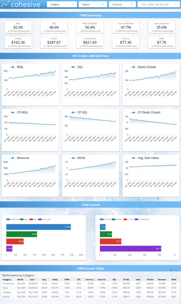
Overview:
This section provides a high-level snapshot of CRM health, summarizing how demand is converting from qualified leads through closed deals and revenue. The KPI tiles surface the most critical funnel volumes, conversion rates, and unit economics in one place, allowing fast assessment of overall pipeline performance.
By combining volume, efficiency, and outcome metrics, this view establishes baseline context before deeper funnel, trend, or channel-level analysis.
Insights:
Viewed together, these KPIs indicate whether the pipeline is scaling efficiently or accumulating friction downstream. Strong lead and SQL volume paired with stable cost metrics signals healthy demand generation, while shifts in close rates or cost per sale highlight where performance may be tightening or improving.
This summary helps teams quickly determine whether issues are likely rooted in lead quality, sales qualification, or close effectiveness, and whether optimization efforts should focus upstream in marketing or downstream in sales execution—before drilling into detailed views.
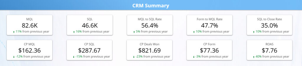
Overview:
This tab tracks how CRM performance evolves over time, following qualified demand from MQLs through SQLs, closed deals, and revenue. The trend tiles pair volume metrics (MQLs, SQLs, deals) with efficiency and value indicators (cost per stage, ROAS, average sale value), allowing pipeline momentum and quality to be evaluated together.
By presenting upstream and downstream trends side by side, this view shows whether growth in demand is translating into proportional business outcomes.
Insights:
When read together, these trends reveal whether pipeline growth is being driven by improving efficiency, increased volume, or both. Rising lead and deal counts alongside declining or stable cost metrics indicate strengthening pipeline health, while divergence between volume growth and cost efficiency signals emerging friction in qualification, sales readiness, or close execution.
The lower revenue, ROAS, and average sale value trends add critical context by showing whether improvements in funnel performance are compounding into meaningful revenue impact, or if gains are offset by smaller deal sizes or higher downstream costs. This makes it easier to distinguish sustainable performance improvements from short-term volume spikes and to identify where optimization efforts should focus next.
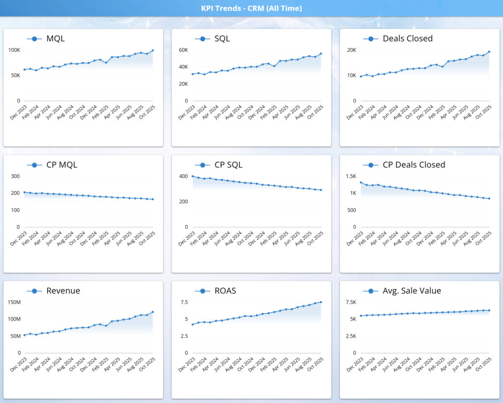
Overview:
This section visualizes how leads progress through the CRM funnel, from form submissions to MQLs, SQLs, and closed deals. The waterfall highlights volume at each stage, while the accompanying cost and conversion indicators show how efficiency changes as prospects move deeper into the funnel.
Insights:
This view makes funnel health immediately visible by revealing where value is gained or lost between stages. It helps teams pinpoint whether constraints are driven by lead quality, sales qualification, or close rate, and identify where optimization efforts will have the greatest impact on downstream revenue and efficiency.

Overview:
This table provides a structured, end-to-end view of funnel performance by key dimensions such as category, market, or time period. It connects media-driven demand through each CRM stage—from leads and MQLs to SQLs, closed deals, and revenue—while layering in conversion rates and unit economics at each step.
By consolidating volume, efficiency, and outcome metrics in a single table, it enables precise comparison of how different segments progress through the funnel.
Insights:
Viewing the full funnel side by side makes it easy to pinpoint where value is created or lost. Differences in conversion rates or cost per stage quickly reveal whether performance gaps are driven by lead quality, sales qualification, or close effectiveness rather than top-of-funnel volume alone.
This table is especially useful for diagnosing structural issues—such as strong lead generation with weak downstream yield, or smaller pipelines that convert efficiently—and for prioritizing optimization efforts that will have the greatest impact on revenue and ROAS.
Channel Performance Tab
Overview:
This tab provides a comprehensive view of performance by marketing channel, connecting media spend and engagement to downstream CRM outcomes and revenue. It brings together channel-level summaries, efficiency metrics, and supporting trend and distribution views to show how each channel contributes across the full demand funnel.
By standardizing metrics across channels, this tab enables clear, apples-to-apples comparison of scale, efficiency, and business impact in a single place.
Insights:
Looking across channels reveals which platforms truly drive value versus volume. Channels that appear strong on impressions or clicks can be quickly evaluated against conversion quality, cost efficiency, and downstream sales contribution to understand their real effectiveness.
This view helps teams identify where to scale high-performing channels, where efficiency breaks down deeper in the funnel, and where optimization or budget reallocation will produce the greatest incremental return—supporting more confident, data-driven channel strategy decisions.

Comparative Results by Property
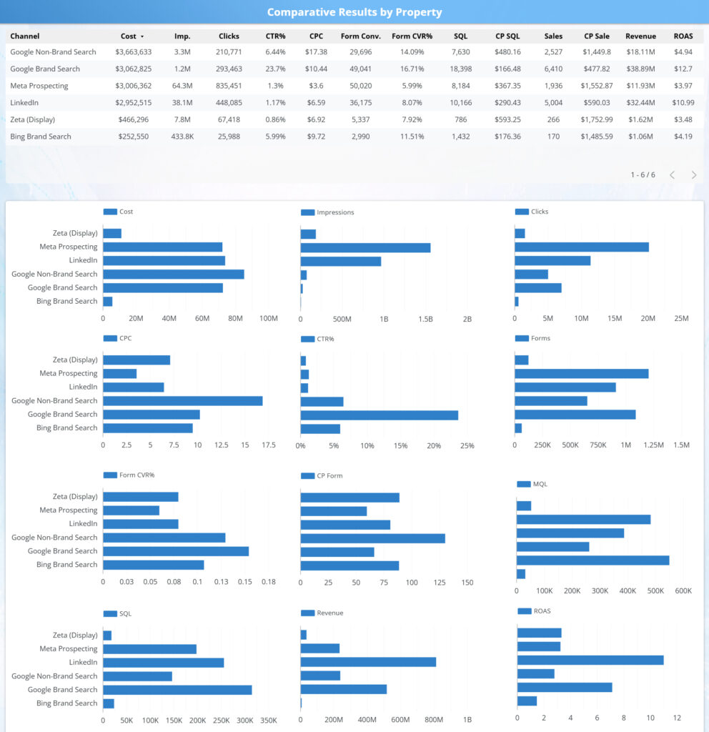
Overview:
This table compares performance across channels from spend through revenue, aligning media efficiency with downstream CRM outcomes in a single view. It connects impressions, engagement, and conversion metrics directly to SQLs, sales, revenue, and ROAS, enabling clear cross channel comparison.
Insights:
By viewing media and CRM metrics side by side, this analysis reveals which channels are driving scalable revenue rather than just traffic or leads. It highlights where budget is producing strong downstream returns, where efficiency breaks down deeper in the funnel, and where optimization should focus on cost control, lead quality, or funnel progression to improve overall performance.
Channel Comparison
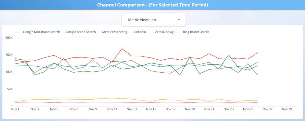
Overview:
This grid compares paid media and downstream CRM outcomes side by side for each major channel, showing how performance differs across volume, efficiency, conversion quality, and revenue impact. By breaking metrics into consistent small multiples, it provides a clear, comparable view of each channel’s role across the full performance stack.
Insights:
This view quickly reveals channel tradeoffs, such as high-volume drivers versus high efficiency performers, and channels that generate leads but underperform deeper in the funnel. It helps teams identify which channels should be scaled, optimized, or constrained based on their true end to end contribution, not just top line media activity.
CRM Waterfalls by Channel
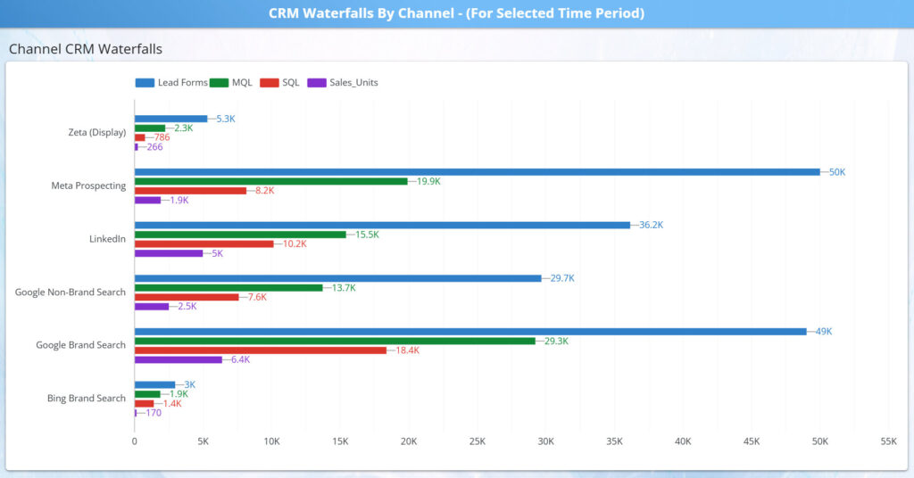
Overview:
This waterfall compares how each channel progresses through the CRM funnel, from lead forms to MQLs, SQLs, and closed sales. By showing each stage side by side, it makes downstream performance differences across channels immediately visible for the selected time period.
Insights:
This view highlights where channels lose momentum in the funnel, whether at lead quality, sales qualification, or close, versus where volume consistently converts deeper into revenue. It helps teams distinguish channels that generate demand from those that efficiently convert demand into sales, supporting smarter budget allocation, qualification tuning, and sales alignment decisions.
CRM Waterfall Ratios
Overview:
This view compares how efficiently each channel converts demand through the CRM funnel by isolating conversion rates at each major transition, from form submission to MQL, MQL to SQL, and SQL to closed deal. By focusing on ratios rather than volume, it enables clean comparison of channel quality and sales readiness.
Insights:
By separating efficiency from scale, this chart highlights channels that punch above their weight on lead quality and close rate, as well as channels that generate volume but struggle downstream. These signals help teams diagnose whether gaps are driven by targeting, qualification criteria, or sales follow up, and prioritize optimizations that improve yield rather than simply increasing spend.
CRM Cost Per Waterfalls
Overview:
This view breaks down cost efficiency across each stage of the CRM funnel by channel, translating funnel performance into unit economics. It shows the true cost to generate a form, MQL, SQL, and closed deal, revealing how spend compounds as leads move through qualification and close.
Insights:
By comparing cost-per metrics side by side, this chart highlights which channels maintain cost discipline through the full funnel and which appear efficient early but become expensive downstream. This perspective helps teams identify where incremental spend is most likely to produce profitable outcomes, versus where rising acquisition costs signal funnel leakage or sales inefficiency.
Regional Performance Tab
Overview:
This tab analyzes performance by region and market, connecting media investment to downstream funnel outcomes across geographies. By standardizing spend, efficiency, and revenue metrics, it enables clear comparison of how different regions convert demand into appointments, sales, and cash impact.
The combined views surface both high-level regional patterns and deeper market-level detail, making geographic performance differences easy to evaluate in context.
Insights:
Reviewing regional performance highlights where results scale efficiently versus where costs rise without proportional return. Markets with similar spend levels often show materially different conversion quality, close rates, or unit economics, revealing opportunities for targeted optimization.
This tab helps teams identify regions to prioritize for expansion, markets that require efficiency improvements, and geographies where budget reallocation or localized strategy changes can materially improve overall performance—supporting more informed, market-specific investment decisions.
Comparative Results by Region

Overview:
This view compares regional campaign performance to show how effectively local markets convert spend into downstream revenue. By standardizing media, funnel, and revenue metrics across regions, it enables clean, apples-to-apples comparisons that remove the distortion of national rollups.
Insights:
The table quickly surfaces markets that generate stronger revenue efficiency—such as higher close rates or ROAS—despite similar spend levels, as well as regions where costs inflate without proportional return. These patterns help guide market-level optimization decisions, including budget reallocation, regional strategy adjustments, and identification of scalable performance models across geographies.
Top Regions by Metric
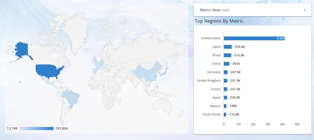
Overview:
This view enables dynamic exploration of regional performance across media, funnel, and revenue metrics. By pairing a geographic heat map with a ranked bar chart, it shows where performance is concentrated and how it changes as users switch between cost, volume, efficiency, and outcome metrics.
Insights:
The map provides immediate spatial context, surfacing geographic clusters and outliers, while the ranked view highlights which regions lead for the selected metric. Together, they reveal not just which markets perform best, but where performance is happening and how regional strength shifts depending on the metric lens. This helps teams identify regions driving scale, efficiency, or revenue—and adjust investment and strategy accordingly.
Keyword Performance Tab
Overview:
This tab provides a granular view of paid search performance at the keyword level, connecting spend and engagement directly to conversions and cost efficiency. By combining ranked keyword distributions with detailed performance tables, it enables analysis of how individual search terms contribute to demand generation and downstream results.
The structure supports rapid filtering by market, campaign, and time period, allowing users to move seamlessly from high-level keyword patterns to precise, actionable detail.
Insights:
Keyword-level analysis reveals which queries consistently drive efficient conversions versus those that absorb spend without proportional return. High-volume terms can be evaluated alongside cost-per-conversion and conversion rate metrics to distinguish true demand drivers from inflated traffic sources.
This view supports data-driven search optimization, including bid adjustments, keyword expansion, and pruning strategies tailored by market. It also helps identify emerging high-intent queries and local keyword nuances that can materially improve efficiency and conversion outcomes when scaled appropriately.
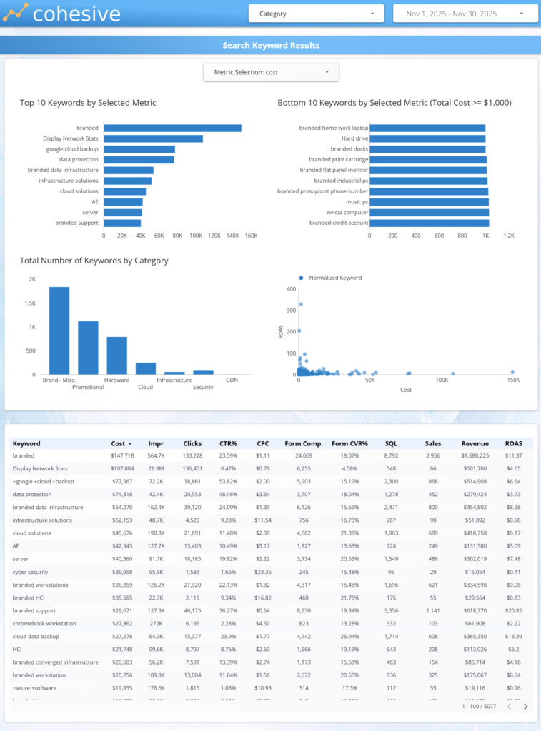
Search Keyword Results Charts
Overview:
This tab visualizes keyword performance distributions across selected metrics, allowing users to quickly assess how individual search terms perform relative to one another. By pairing top and bottom keyword rankings with category distributions and scatter analysis, it provides immediate context around performance concentration and variability.
The interactive metric selector enables rapid switching between volume, efficiency, and outcome measures, keeping all charts aligned to the same analytical lens.
Insights:
These views highlight the imbalance that often exists in keyword portfolios, where a small subset of terms drives the majority of results while long-tail keywords contribute unevenly. Comparing top- and bottom-performing keywords helps identify candidates for scaling, optimization, or removal.
The distribution and scatter visuals surface trade-offs between volume and efficiency, making it easier to spot high-intent, low-cost opportunities as well as expensive keywords that underperform. Together, these insights support more disciplined keyword management and smarter allocation of search spend.
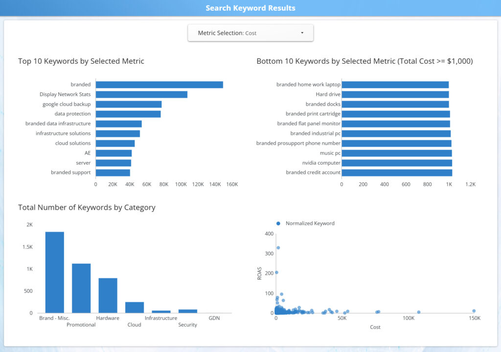
Search Keyword Results Table

Overview:
This table provides a detailed, row-level view of search keyword performance, connecting spend and engagement metrics directly to conversions, revenue, and ROAS. It serves as the most granular lens in the search analysis, enabling precise inspection of how individual keywords contribute to overall program outcomes.
With sortable columns and flexible filtering, users can quickly shift focus between scale, efficiency, and revenue impact.
Insights:
This view makes it easy to identify high-intent keywords that consistently drive conversions at efficient costs, as well as terms that absorb spend without proportional return. Comparing CTR, CPC, conversion rate, and revenue side by side reveals whether performance gaps are driven by demand, relevance, or bidding strategy.
The table supports tactical search optimization decisions, including bid adjustments, keyword expansion, match-type refinement, and pruning underperforming terms—allowing teams to optimize at the level where budget decisions actually occur.
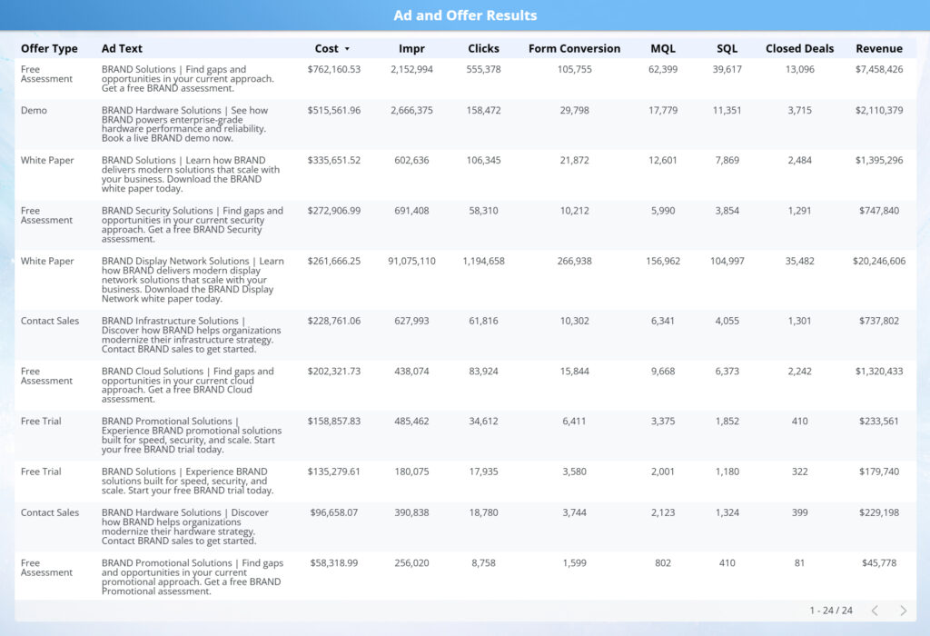
Ad Performance Tab
Overview:
This view provides a creative-level performance breakdown, connecting individual ads to spend, engagement, conversions, and downstream revenue. By surfacing ad text alongside full-funnel metrics, it enables clear evaluation of how specific messaging and execution choices translate into business outcomes.
The table supports direct comparison across ads within the same channel or campaign, making creative impact immediately visible.
Insights:
This view highlights which ads are driving efficient conversions and revenue versus those generating engagement without downstream return. Comparing CTR, conversion rate, cost per conversion, and revenue side by side reveals whether performance differences are driven by creative relevance, offer strength, or audience alignment.
The table enables actionable creative optimization, supporting decisions around scaling top-performing ads, refreshing fatigued variants, refining messaging, and reallocating spend toward creatives that deliver measurable sales impact—not just clicks.
Landing Page Performance Tab
Overview:
This tab evaluates how landing pages convert paid media traffic into leads, appointments, and downstream outcomes. By tying page-level performance to media spend and engagement metrics, it shows how effectively each landing experience supports conversion across the funnel.
The combination of ranked charts and detailed tables enables both high-level comparison and page-specific analysis across markets, channels, and campaigns.
Insights:
This view quickly surfaces which landing pages are enabling efficient conversion versus creating friction. Differences in conversion rate, cost per lead, and downstream performance reveal whether issues stem from page design, message match, form structure, or traffic quality.
By connecting landing page performance directly to sales outcomes, this tab supports actionable optimization decisions—including prioritizing pages for CRO testing, aligning ad messaging to high-performing pages, retiring underperforming experiences, and reallocating spend toward traffic-page combinations that drive the strongest business impact.

Landing Page Performance Charts
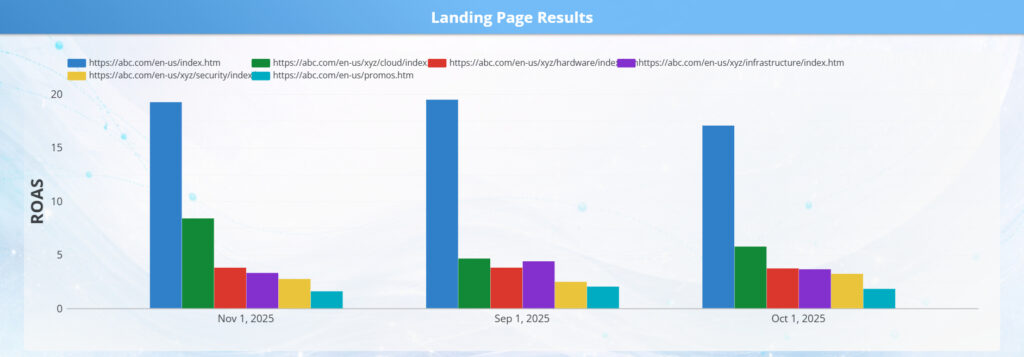
Overview:
These charts provide a visual comparison of landing page effectiveness across key conversion metrics, highlighting how different page experiences perform side by side. By breaking out volume and efficiency measures in a single view, they make relative performance differences immediately clear.
The charted format allows users to quickly scan which landing pages drive stronger engagement and conversion outcomes without needing to interpret detailed tables.
Insights:
This view surfaces clear winners and laggards among landing pages, making it easy to identify which experiences convert efficiently and which may be introducing friction. Large performance gaps often indicate opportunities related to message match, layout, form complexity, or traffic quality.
By visualizing these differences, the charts help teams prioritize CRO efforts, validate which pages are ready to scale with additional spend, and flag underperforming pages that require redesign, testing, or tighter alignment with upstream ad messaging.
Landing Page Performance Table
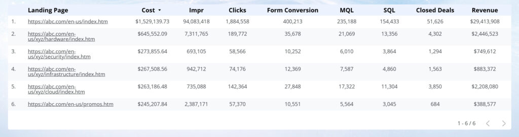
Overview:
This table provides a detailed, row-level view of landing page performance, connecting spend, traffic, conversion rates, and downstream sales outcomes in a single structured view. It allows users to move beyond visual summaries and evaluate individual landing pages with precision.
By consolidating volume, efficiency, and revenue metrics side by side, the table supports direct comparison across all active landing pages.
Insights:
This view helps identify which landing pages consistently convert traffic into leads, appointments, and sales, and which pages absorb spend without delivering proportional return. Differences in cost per conversion and downstream performance often point to issues such as message mismatch, page speed, form design, or audience alignment.
The table is designed to support actionable CRO and media decisions, including prioritizing pages for optimization, retiring underperforming experiences, and scaling high-efficiency pages with confidence.